I thought I'd share one of my favourite illustrators with you all. Clint Reid has a really distinctive style and comes up with some really interesting images. All of these images were from his Behance page and you can find out more about him and his work at tillmanproject.com.
March 26, 2014
March 25, 2014
Pinterest Picks: Workspace
This year I plan to set up a little workspace in our little house so here are some images I have found as inspiration:
In the first three images, I love the different ways of displaying inspiration above the desk; the pegboard, wire frame and wooden board. The 4th image shows the trestle style desk I would like to have (this one is from NZ's Company). The 5th and 6th photos show some cool options for storage, I like the majority neutral colours with subtle use of others.
March 24, 2014
DIY Vinyl Tree Decals
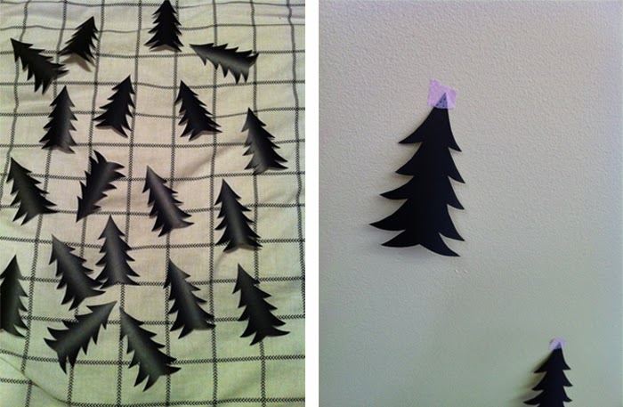
Last week I shared these tree decals on my pinterest wishlist, and later saw some DIY tutorials of people using blackboard vinyl stickers to make their own decals. I decided to give it a go with some blackboard sticker I had leftover from a project ages ago.
2. I made a template and used this to draw tree onto the sticker.
3. I spent ages cutting them all out.
4. I used tape to arrange them on the wall. These also doubled as markers for where each tree went while I was peeling off the backing paper. I stuck each tree onto some fabric and then pulled it off to make it slightly less tacky so they come off when they need to be removed.
5/6. Bedroom after.
I made 36 decals to cover this space, it used around 60x40cm of blackboard sticker. It probably took a couple of hours all up; the tracing, cutting, arranging and sticking. I'd also read up on how removable the stickers were first, and did a test in a hidden patch of wall in the wardrobe which lifted off really easily.
March 19, 2014
Font Men
I came across this video today about a company who work in typography design and it's quite cool! Very interesting to see the processes behind their work.
The segment from 2.25 was of particular interest to me, explaining which letters they start designing first, because these become a catalyst for the look and feel of the whole set.
A big part of my Graphic Design study (at University) was on typography, and I think that how you use text can make the difference between good and bad design, or good and amazing design. During my degree our lecturers split us into class groups, each with a different project. I was in the 'Information Design' class which I found so helpful, and use those skills regularly, and some of my friends were in a type design class and got to design a whole typeface for their assignment.
Font Men - SXSW 2014 Official Selection from dress code on Vimeo.
March 18, 2014
Instagram Picks
I don't have a fancy camera to take photos with (and I probably would never carry one around with me if I did) but I do enjoy collecting a few snaps of what I'm doing on my phone and posting to Instagram.
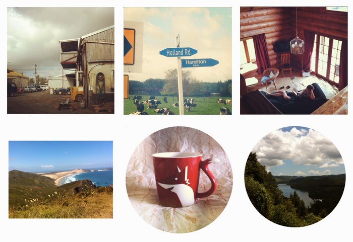
Here is a collection of shots I've taken that I quite like:

Description Clockwise from top left:
1. When I went to buy my car a couple of years ago it was being stored behind the shops on the main street of Clevedon.
2. I have always loved the name 'Holland Road', which is on the 1b route from Auckland to Cambridge. Mumford and Sons must have liked the name too because it's the name of one of their songs.
3. Andrew and I split our honeymoon into two locations, this is the cabin where we spent week two (Mt Hiwi Lodge in Taranaki).
4. Taken on a short tramp in the Hunua Ranges. Amazing what beauty you can find so close to home.
5. My favourite fox mug I bought from Starbucks. The tail for a handle is too cool!
6. Cape Reinga (top of New Zealand). Love the bright colours in this photo.
Photos are from my Instagram account.
March 17, 2014
Pinterest Wishlist
I've just started a Wishlist on Pinterest so thought I'd share a few items I've seen and liked recently. The pins will link you to where you can buy each item.
It would be great to own a jumper in this reddish colour for autumn and the coming winter and I can't decide between these two. I already own the ampersand jumper in grey so it may be a little strange to own it twice.
It would be great to own a jumper in this reddish colour for autumn and the coming winter and I can't decide between these two. I already own the ampersand jumper in grey so it may be a little strange to own it twice.
March 16, 2014
Glorious Bandits
 Welcome to my new blog!
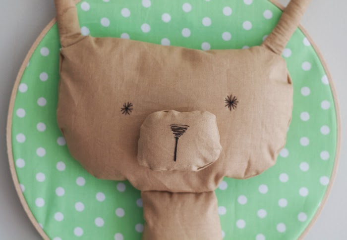
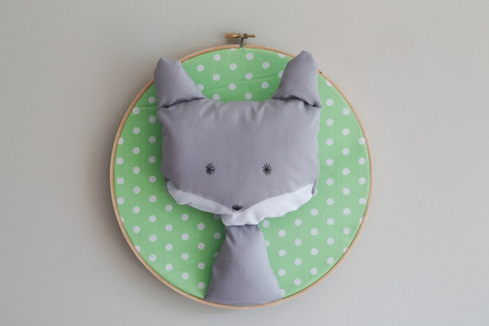
I thought it was appropriate that my first post was to profile some of my handmade products that I sell under the name 'Glorious Bandits'. They are available to purchase on the Glorious Bandits Etsy Store and you can keep up with what's happening on the Glorious Bandits Facebook Page.

Photos by Maree from Rose Tinted Illustration


